For WT160.....messed up on the first butterfly (the one near the bottom) so had to cover and use another rub on to "hide" my OOPS!! that led to the other butterflies also being cut out and popped up with dimensionals. Colored the butterflies with Copics...TFL
I would welcome any constructive crit on how you would change this card to make it better! (I'm trying to improve!!)
Date: Friday, April 4, 2008 GMT Views: 1935
Favorited:27
Registered: May 18, 2005 Location: Northern MN woods Posts: 11652
Fri, Apr 04, 2008 @ 10:45 AM
Great colors and details ~ TFS!
------------------------------ ~ Carol G.
"The Lord is a Mighty Savior who rejoices over you with great gladness. With His love, He will calm all your fears and exult over you by singing a happy song."
Zephaniah 3:17
Registered: November 7, 2007 Location: Amarillo TX Posts: 1839
Fri, Apr 04, 2008 @ 7:23 PM
Constructive Criticism Thread:
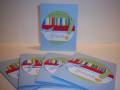
I think it's GORGEOUS just as it is. It's a lovely OLC. The only thing I could think of - and I don't even know if it needs it - is to add some more blue --- maybe in the way of some brads in the lower right?
Registered: December 6, 2007 Location: Fayetteville NC Posts: 241
Sat, Apr 05, 2008 @ 12:02 AM
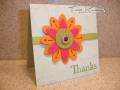
Constructive Criticism Game - I really like it the way it is! I may have added a "tie" "bow" on the ribbon instead of doing it straight, otherwise it's great
Registered: September 21, 2004 Location: Minglerville, Michigan Posts: 69914
Tue, Apr 08, 2008 @ 4:29 AM
Constructive comment:
Wow! I wish I had something to add! I think it's a gorgeous card! Love the one layer look and the simplicity of the design. Too much would ruin it. My only ideas for possible variances: 1. add a knot in the ribbon - don't tie one on, just knot somewhere along the ribbon itself.
2. Maybe add some brads that would give dimension to the 'berries' on the vine or flourish.
Keep it simple and let the card speak for itself!