Image and papers from pinkpetticoat.com
Added sparkle to dots on bloomers
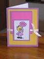
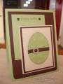
Know there'e something wrong with this card - not sure if its the papers or if I shuold have printed the image bigger, so throwing it open for comments in constructive criticism thread!
Date: Monday, March 31, 2008 GMT Views: 430
Favorited:3
Registered: November 7, 2007 Location: Amarillo TX Posts: 1839
Mon, Mar 31, 2008 @ 2:58 PM
Participating in the Constructive Comment Thread
I agree with you that your stamped image is too small. It is not the focal point of your card - the green mat behind it is. The card has really big polka dots on the CP and then the middle mat is fairly large. So your stamped image panel is very small in comparision. It's the wrong scale.
Now, for what's right about this card. All the repetition. The two polka paper, the polka bum with sparkles, the round sparkle gems and the polka ribbon!
Registered: June 26, 2007 Location: Ossineke, MI Posts: 10350
Tue, Apr 01, 2008 @ 4:45 AM
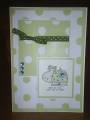
**snort!** Ohmagosh... I could send this card to SO MANY of my friends! They would love it! I need to check out these stamps. On the constructive side, I think a much darker mat around the hippo would have brought it out much better. Something like SU's Handsome Hunter or Chocolate Chip. Your eye is drawn to the ribbon, which is cute, but you want it on your hippo-butt.
------------------------------ Pegg Thomas Socialism is trickle up poverty.
Registered: September 26, 2006 Location: On the east side of the bridge Posts: 1564
Thu, Apr 03, 2008 @ 7:58 AM
* Constructive Comment thread *
Love the hippo. The way it's embellished is so cute.
I agree with the previous comments. Perhaps moving the hippo to the center of the card (on a darker mat). Or even placing the matted hippo where the ribbon is and moving the ribbon underneat the hippo would balance the card more.
Great papers!
------------------------------ Linda
My little gallery
Registered: July 19, 2004 Location: Lynnwood, WA Posts: 4133
Thu, Apr 03, 2008 @ 8:32 AM
I love your colors! Have you thought about bringing in a thin mat of the blue on those layers? It would help define the edge and tie in your embelishments.
------------------------------ Sarah CAS Challenge Spring 2013 Design Team Member Visit my blog
Registered: January 26, 2006 Location: technically, So Cal. But mostly here! Posts: 14518
Sun, Apr 06, 2008 @ 12:07 PM
Another constructive comment: I agree with the above suggestions: the image is "lost" my first thought was that it needed a darker panal to make it pop more....but a larger image with a darker panal may be what is needed.
The Rights: CUTE polka dot theme!! (and the image is adorable too!)