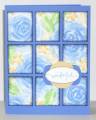
I don't have Pretty Peony, so I used the closest stamp set I could think of, Roses in Winter. Kept the layout and sentiment the same but changed the colors to an old CC I hadn't done yet (only 85 left to do!). For some reason I thought these colors wouldn't work together right, the Gable Green was kinda throwing me for a loop. But after I got it on paper I liked it I sponged the edges with Night of Navy which is maybe a bit too dark; if I were to redo the card I'd use Not Quite Navy or Ballet Blue instead.
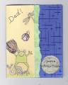
I kept the sentiment the same, but I CASEd the treatment of it from this card: Blooming Cute by Petal Pusher at Splitcoaststampers
I used the key tab punch instead of the designer label punch since I don't have that one.
Date: Sunday, March 2, 2008 GMT Views: 1802
Favorited:7
Registered: January 9, 2008 Location: Western MT Posts: 161
Sun, Mar 02, 2008 @ 11:59 PM
I like the Navy on the sponged edges. The panels not only stand out individually but also as one and that is not always an easy thing to accomplish. I wouldn't change a thing!
Registered: July 20, 2004 Location: Arlington WA. Posts: 31122
Mon, Mar 03, 2008 @ 4:02 AM
Christy this is stunning! I just love computers! It is awesome to think that you play right along with us in the US ! then there is Canada, Sweden,Norway,UK,Australia & Japan! Splitcost should be WIDE WORLD OR GOBEL
------------------------------ CindyProud Fan Club Member SCS # 9686
FS70
QFTD127
Registered: July 16, 2006 Location: Tucson, AZ Posts: 1389
Mon, Mar 03, 2008 @ 11:25 AM
You're so brave. This one takes awhile (at least for me). I think it worked beautifully with your colors and roses. Honestly, I like the Navy edges . . . really makes each piece pop. Thanks for playing!


 I sponged the edges with Night of Navy which is maybe a bit too dark; if I were to redo the card I'd use Not Quite Navy or Ballet Blue instead.