To be completely honest, when I saw the list of colors for the color combo, I wasn't that enthusiastic. It seemed rather drab: Basic Gray, Basic Black and River Rock.
So I was surprised - like always.
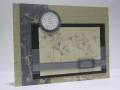
Card base is Basic Black and the front is trimmed up 1 1/4" and scalloped with the corner rounder punch. I embossed the sentiment in silver on the strip of the back of the card showing.
I don't have Basic Gray ANYTHING, so I had to improvise. Some paper by Basic Grey's Periphery line works really well to get that dark charcoal color. It's hard to see in the card (and in real life) but the paper is stamped with Linen in Palette Charcoal ink.
My main image is inked in River Rock and rolled in Palette Charcoal. The corners were rounded and it was put on a piece of River Rock cardstock that has slits for the ribbon to slide through courtesy of my crop-a-dile. The ribbon is a really good match for color with the River Rock.
Date: Tuesday, October 9, 2007 GMT Views: 632
Favorited:5