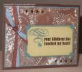
This card today made me realize how pitiful my ribbon supply is! I think the SU! French blue grosgrain matches Blue Bayou very well IRL but it looks terrible in this picture! I really wanted some nice chocolate taffeta this morning to use on this! *sigh* Guess I'll just settle for Hershey's instead!
Registered: June 10, 2007 Location: BC Posts: 44872
Tue, Oct 02, 2007 @ 6:50 AM
I think this card looks gorgeous!! I know how frustrating it is when colours don't show the way we'd like in a photgraph - but still it is a gorgeous card...so this is what Kitchen Sink stamps are about... VERY LOVELY! TFS!
Registered: May 3, 2007 Location: Out and About Posts: 17520
Tue, Oct 02, 2007 @ 7:30 AM
This is a great card. I completely understand the frustrations of things not looking right in pictures when they look right IRL. I even have times when things look great in pictures but real life...
Registered: July 20, 2007 Location: Fergus, Ontario, Canada Posts: 52516
Tue, Oct 02, 2007 @ 7:48 AM
This is very rich looking. I like the sentiment corner treatment. Don't feel bad about the ribbons. I have whole drawer full and still find it difficult to match them to my cards.
------------------------------ Ina
"Surely His salvation is near those who fear Him, that His glory may dwell in our land." Psalm 85:9
Registered: January 26, 2007 Location: Fredericksburg, VA, but originally from Scotland!:) Posts: 12742
Tue, Oct 02, 2007 @ 8:00 AM
This is beautiful Tammy! Love the sentiment and I love the dp!! My cards NEVER look the same on the computer as they do IRL, so I understand your frustration, nonetheless, your card is beautiful