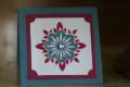
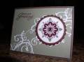
Well, it looked better in my head, but... this is it. I used the ever so popular Baroque Motifs as my new set to showcase. However, it just didn't work out as well. I was inspired by this ribbon and I should have used a different color cardstock as the main background. I also tried the embossed medallion which is a neat technique. TFL!
Date: Thursday, July 26, 2007 GMT Views: 812
Favorited:3
Registered: April 12, 2005 Location: SW Michigan Posts: 63356
Thu, Jul 26, 2007 @ 11:18 AM
That ribbon is so perfect with this set Deborah. I think the cardstock looks just fine. I love the metal medallion too. I have to remember to try that.
------------------------------ Shelly Gallery BLOG
Splitcoast Dirty Dozen Splitcoast Challenge Hostess & DSS Moderator
Registered: February 4, 2005 Location: Being positive & happy! Posts: 62877
Thu, Jul 26, 2007 @ 2:00 PM
nice idea..I think what makes it look stiff is the flourish...maybe if we saw more ends and curls. Right now, it almost looks like you have 4 boxes in your background. (make sense?) But over all...really neat!
Registered: June 2, 2007 Location: Regina SK Posts: 17494
Fri, Jul 27, 2007 @ 12:52 AM
The medallion is very stunning, lovely card.
------------------------------ Kathleen
For by grace you have been saved, through faith; and that not of yourselves, it is the gift of God... Ephesians 2:8
Registered: December 19, 2006 Location: Office #32, The Towers, GSOLFOT Sockeeland Posts: 1630
Fri, Jul 27, 2007 @ 12:19 PM
The medallion worked very nicely for the embossed technique. I just taught the technique at a class a few weeks ago, but had trouble finding a great stamp to use. This one works very well!