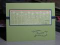
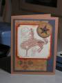
I started out to showcase the new Cerise DS papers, but went off on a Basic Gray tangent. I LOVE how the new Basic Gray color goes so well with our other colors!
The sentiment fit perfectly in the scallop punch! You can line up 'in the little' in the scallops so they do not get hacked off.
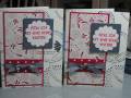
There are two cards here - one uses Really Red, and one uses Ruby Red. I wanted to see which one looked better. I think the Real Red is a better match, but it works with Ruby Red, and is a bit softer look.
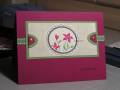
The flower on the left-hand card covers up an ink schmear from the bg stamp.
Date: Sunday, July 15, 2007 GMT Views: 1082
Favorited:7
Registered: October 17, 2005 Location: East Bethel, MN-north of the Twin Cities Posts: 4308
Sun, Jul 15, 2007 @ 8:52 PM
Great cards. I've had my eye on that dp ever since I saw it. For some reason it appears to be red and off white in the catty to me, but here it seems white. I love the way you showed it off. You've done a fabulous layout. I couldn't tell that one was red and one ruby red. I think they are both wonderful. TFS
Registered: February 19, 2006 Location: Texas (Killeen, Fort Hood area) Posts: 6985
Thu, Jan 17, 2008 @ 4:47 PM
These are gorgeous!!!!!! My computer isn't showing a difference in the reds, but I can imagine. I really loved these, and fav'd them. the spot bg is a perfect match for the Cherise dsp.
------------------------------ DebThe Dolphin/Whale trainin' ~~ Army Mama Spammy. Prayers and Blessings for all our troops, and their families!! My Gallery LinkIf you don't want to comment, you can just throw money. lol