Registered: March 17, 2004 Location: Chapin, South Carolina Posts: 2207
Wed, Jan 05, 2005 @ 10:40 PM
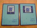
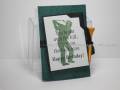
I like #1 better also. I think that the eyelets make the background CS pop more. They both look really good, though. I would love to receive either one!
Registered: May 23, 2003 Location: Ontario, Oregon Posts: 9432
Thu, Jan 06, 2005 @ 8:16 AM
Dittos on the eyelets - they echo the spots on the package design and add a nice textural interest....The composition of the 2nd one is very nice, but I think it would be improved with a different ribbon (perhaps grosgrain or a darker color would have more impact.) Just an observation, they're both dandy cards!