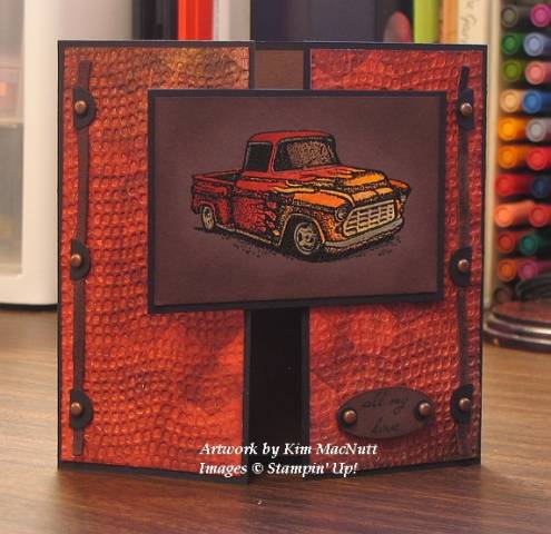
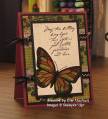
I really loved this simple design. Sometimes the simplest designs are the most satisfying to play with, don't you think?
As you can see, I used the Cuttlebug embossing folder yet again! I can't help it, I love the look, especially on designer paper.
I made this card as a 5.25" square to fit in my 5.5" square envelope. The directions are on Beate's blog (through the above link).
I used black as my background cs. For the inside, I made a square of Chocolate Chip cs to go inside so the sentiment phrase would be visible. I sponged the inside square's edges with Chocolate Chip ink after stamping the sentiments. Then I adhered it inside the card. Sorry for the poor sentence structure.
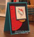
For the outside front, I used pieces of Basic Grey designer paper (Urban Couture, I think) and rubbed them with a vintage distress ink by Tim Holtz. Then I cuttlebugged them using the Mesh embossing folder. It was really tricky trying to line up the holes for the brads as they had to go through a little 1/2 circle piece of cs, the leather strip and the cuttlebugged cs. Very difficult. I won't even try to explain what I did. There's probably an easier way than mine. ;) The look was worth the trouble to me, thankfully.
For the oval sentiment, I used the smaller oval punch and sponged it with Chocolate Chip ink and punched 1/16" holes on either side. Then I punched 1/16" holes in black cs and, turning a 1/4" circle punch upside down, punched to get the smaller holes in the center - like a tiny doughnut. I used antique-finish brads and adhered them as you see. I used a bit of Diamond Glaze (Crystal Effects) on some Dimensionals to adhere the sentiment to the card front. That helps it adhere better to the cuttlebugged surface.
For the pickup truck feature, I first powdered a piece of Chocolate Chip cardstock with my embossing buddy pillow thingy. Then I stamped the truck using Brilliance Graphite Black pigment ink and heat embossed it with Detail Black ep. Then I bleached the inside design of the truck completely and colored it with a combination of waterbrush/inks and Prismacolor pencils (silver/gold for the chrome portions). I just kept applying color until I got it the way I wanted it. When finished, I sponged the area around the truck with Chocolate Chip ink, then mounted it to black cs. I adhered that piece to one side of the card with Dimensionals.
Thanks to Miz Beate, for the inspiration!
Hope you enjoy! Thanks for looking!
Date: Wednesday, June 13, 2007 GMT Views: 2133
Favorited:38
Ink: Brilliance Graphite Black pigment ink, "Vintage Photo" Distress Ink by Tim Holtz, Chocolate Chip, Really Rust, Ruby Red, Only Orange, Summer Sun, Real Red
Accessories: bleach, water brushes, sponges, Detail Black embossing powder, Prismacolor silver and gold pencils, Dimensionals, Diamond Glaze, antique brads, leather strips, 1/16" hole punch, 1/2" circle punch, 1/4" circle punch, sm. oval punch, Cuttlebu
Friends are like the walls of a house. Sometimes they hold you up, sometimes you lean on them. But sometimes, it's enough to know they're just standing by.
Registered: November 4, 2006 Location: Midwest Posts: 24760
Wed, Jun 13, 2007 @ 7:48 PM
This is one of the few embossing folders I don't have, but after seeing this, I think it needs to be added to my collection ... love the reverse de-bossed effect ... and the colors on that truck & paper are just frabulous.
Registered: April 18, 2004 Location: Moving home to Kiwiland sometime soon, I hope! Halifax, Nova Scotia, Canada until then. Posts: 714
Sat, Jun 16, 2007 @ 11:56 AM
Oh my, I never thought to Cuttlebug Designer paper! DUH! A whole new world has dawned!!!!
And thank you so much for the wonderful directions! I appreciate the time you put into the creation AND the uploading!
------------------------------ "Bother," said Pooh, "Eeyore, ready two photon torpedoes and lock phasers on the Heffalump. Piglet, meet me in transporter room three. Christopher Robin, you have the bridge." My Gallery