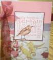
Well, folks. I hate to say this but, this did not turn out the way I had it pictured in my mind. I think it is way too busy and would like to get some feedback on it. I can't stand to throw things away and would prefer to post a bad card and get some assistance from all of you talented creators out there. This is dp from Basic Grey's Scarlett's Letter and thought it would be good with the Natural Beauty set. I think the subject matter is right but the execution is sooooooo wrong!! HELP!!!
Date: Saturday, May 26, 2007 GMT Views: 427
Favorited:3
Your card is beautiful. It includes ribbon, flowers, gorgeous paper, and 3 of my favorite sentiments. And it's well coordinated and balanced. I love colorful cards, and am easily bored w/blah. I might??? have matted the embellishments w/black - would have to see it to compare. I'm strictly visual - got to SEE it. Plus I'm really into black matting with colorful/busy papers right now.