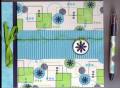
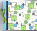
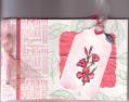
I am at a loss with this set. I am making a matboard journal for someone at work to give her 17 yr old niece. She wants it in lime gree, navy and turquoise and wants a retro look (she said shapes would be good...this si the first set that came to mind). Ok, this is NOT my style at all and it does not look retro in my opinion. What do you recommend that I can do to this? I was thinking, after looking through the gallery, that maybe some crimped turquoise paper across the middle would look better? What else? I did put glitter on the small freen circles in hopes of making it look more girly. PLEASE HELP ME...I need this done for tomorrow.
Date: Sunday, December 12, 2004 GMT Views: 1854
Favorited:8
Registered: August 14, 2003 Location: Belle Plaine, Kansas Posts: 875
Sun, Dec 12, 2004 @ 12:43 PM
I like it just as it is!
But if you are really not satisfied? Do you have Wonderful Words? Stamp one of those word, Celebrate would be my choice, and mount it on the crimped turquiose.
Registered: October 22, 2003 Location: South Central Texas Posts: 30074
Sun, Dec 12, 2004 @ 12:47 PM
The hard edges of the squares make it seem kinda masculine. How about more circles than squares, and less order to the arrangement to make it more fun & girly? I like it as is, but for a 17 yo girl, you might want it to be a bit more fun and flirty! How about a punch of orange or pink passion - just a touch with the three circles? Just thinkin' . . . .
------------------------------ Jenn Balcer My Blog
Registered: July 13, 2004 Location: northeast PA Posts: 18124
Sun, Dec 12, 2004 @ 1:04 PM
I like it too but if you want to make it more girly, I would add some flowers. A simple flower like in Love without end could be stamped and layered onto the crimped turquoise that you talked about.
Registered: October 16, 2004 Location: Posts: 2849
Sun, Dec 12, 2004 @ 1:24 PM
I really like this - it is really retro looking and the colors she wanted -- though not sure if it is the computer, or not, but the cardstock circles that are green do not look like they are the gable green, they almost look like sage shadow. Otherwise it looks neat! If you wanted to add something, how about adding a metal circle tag to the front, hang from the ribbon? You could stamp a flower using the colors (see my post response to you in the general discussion forum also, the Petal Prints flower or antoher daisyish flower would work great).
Registered: June 7, 2004 Location: SE Wisconsin on Lake Michigan! Posts: 3104
Sun, Dec 12, 2004 @ 1:42 PM
Thanks for all of your suggestions...unfortunately I don't know her name and only have brushstroke alpha which really doesn't fit this. She was also very specific on colors otherwise I would have picked more girly colors. I kind of like the circle tag idea with flower and ribbon to soften it up a bit! I have a hard time with stamping randomly too...something I'm workin' on ;)
Registered: April 26, 2004 Location: Central Florida Posts: 3802
Sun, Dec 12, 2004 @ 1:43 PM
Are you kidding? I think your journal looks great and your customer will LOVE it. I like the idea of adding some tags or something. I think that will keep the retro look!
Registered: February 24, 2004 Location: Serving True Bloods at Merlotte's Posts: 6155
Sun, Dec 12, 2004 @ 1:49 PM
Honestly, I think it's the navy that makes it look masculine. What if you used a metallic color instead? Or something embossed? Also, maybe it's just me, but it seems the pattern is a little too perfect... perhaps it needs to be more random? (the small squares and cirles are at perfect right angles to each other and the squares are all straight, not angled.) I think it's a nice look, but changing those two things might feminine it up a bit to give you what you need.


 I will have to case this one!