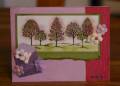
This isn't exactly how I wanted it to turn out but I think it's kind of pretty. I was going for a blossoming tree look - but think I went a little overboard with the sponge daubers and colors in the trees... oops!
The trees are stamped in versamark and embossed with detail black ep on shimmery white paper then sponged olive, pale & perfect plums, rose red inks over it - so shimmery IRL.
Thanks for the closer look!
Date: Monday, April 2, 2007 GMT Views: 789
Favorited:9