Registered: June 12, 2005 Location: Illinios Posts: 2081
Wed, Mar 14, 2007 @ 6:15 PM
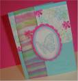
What about putting the Brocade Blue on the bottom. I like the card as it is but it seems like it may be to heavy looking at the top. Does that make since?
Registered: December 27, 2003 Location: Severna Park, MD Posts: 21292
Thu, Mar 15, 2007 @ 8:42 AM
very pretty-since you were looking for CC I will say that if you use the outline stamp on the main flowers it will bring a little "oomph" to the main image
------------------------------ I want people to be afraid of how much they love me-M. Scott
Registered: October 23, 2006 Location: Hoffman Estates, IL Posts: 162
Thu, Mar 15, 2007 @ 3:26 PM
It's a great card you did an excellent job on the pearl-ex.
That being said I agree with camsmom about the outline stamp. Also you might consider a sentiment in the dark blue on the bottom to help balance the dark color on top.
------------------------------ Katie
Visit katemadedesigns.blogspot.com
for amusement, inspiration and tutorials