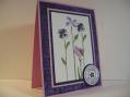
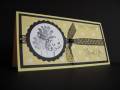
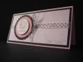
This is really a fun format to play with! Just a 6 x 6 folded in half. I've been wondering what really draws the eye to some cards over others. My DH suggested that I take 10 cards out of my sample basket. 5 cards that I really really liked and 5 cards that I thought were just OK. Then he said compare them and see what the difference is. Overall, the difference was the color. Not the colors themselves, but the combination. All of the cards that I really really liked had high contrasting colors. Monochromatic can be very nice too for a different mood. Maybe leaning more towards elegant. So I made a whole bunch of cards concentrating on high contrast and I just love them all! There is so much to learn about color and design!
Date: Thursday, February 1, 2007 GMT Views: 1424
Favorited:59
Registered: January 20, 2005 Location: Posts: 3586
Thu, Feb 01, 2007 @ 12:28 PM
Super cute - thanks for the ideas about high contrast as well. That's a good thought. I always love cards that have just a touch of black, so that's probably why!
Registered: December 6, 2005 Location: Little Rhody Posts: 3238
Thu, Feb 01, 2007 @ 1:27 PM
great card. Love the contrast of pink and black.
------------------------------ Faith
SU! Demo, Wife and SAHM to two fab girls. Every good gift and every perfect gift is from above and comes down from the Father of lights..


 I like cards with black in them too. TFS!