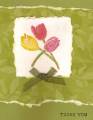
I stamped the "tulip trio" with versamark then colored it with chalk. I after coloring it, I thought the white was a little stark and wished I had used ivory. So, I grabbed the copper pearl ex and a stipple brush and thought I would do a little "bronzing" to darken it. I was sure I would smear the chalk. What I discovered was that the pearl ex kind of "set" the chalk and added highlights to the flowers. Overall, I liked the effect, but not necessarily the card. I'm putting it up anyway. Feel free to copy...ha ha!
Date: Thursday, January 11, 2007 GMT Views: 416
Favorited:2
Registered: November 9, 2004 Location: Lincoln, NE Posts: 9678
Sat, Jan 13, 2007 @ 9:00 PM
Thanks for sharing your discovery. I don't see anything wrong with your card. You are right about the white being a little too stark, but you came up with a pretty good fix.
Registered: November 3, 2006 Location: Terrace, British Columbia Posts: 1122
Sun, Jan 14, 2007 @ 10:25 PM
Thanks for the idea and posting the card to go with it. It really helps to have something visual to "set" an idea in my mind ; ) BTW, I wouldn't mind getting a card like this - really. It has a shabby chic feel to it. (quit scoffing!)


 TFS this technique!