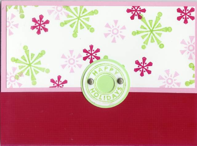
So I like these colours together and I like the style of card (SC101), and I like the canvas stamped on the bottom portion of the card...but something doesn't look right...it's not balanced. Any suggestions?
Date: Thursday, December 7, 2006 GMT Views: 1375
Favorited:16
Registered: January 14, 2005 Location: Vancouver Island Posts: 9572
Sun, Dec 24, 2006 @ 8:26 PM
This card is way cute, but the red panel on the bottom is kind of overwhelming all the other elements. Possibly switching the bottom panel to the green or pink, and making the Riveting image stamped and matted in red; this would reinforce the Riveting circle as the focal point. Or, you could try matting the Riveting circle with a moderately wide circular mat of black. HTH and again, great card!
Registered: August 8, 2005 Location: near the BIG pond Posts: 483
Sat, Dec 30, 2006 @ 5:10 PM
My 11yo dd and I love this card! We are going to try it out tonight. We are going to omit the pink mat for the top. We will try a strip of pink in the center of the two panels, like a ribbon, or try a ribbon instead. We both LOVE the colors. The USPS sent out a postcard advertising stamps this year using these colors. It was so eye-catching I saved it for my color combo idea book! The brads are wonderful. Maybe a bit of diamond dust on some very small snowflakes on the top panel. I know what you mean. This card is so close to 100%...its like Ivory soap...99.97% perfect! Gotta go now so I can make one. A friend loaned me her Merry set until mine comes and I want to return hers this weekend! lol, TFS, lorijane and Erica bean the pre-teen!
------------------------------ Lori Jane Mittlestadt SU! demo/Sr. Supervisor [email protected]