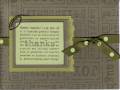
i used tim holtz's tea dye distress ink to age a natural colored cs for the main card and the cherish panel. it perfectly match the already stained look of the basic grey. the heart is 'color box' peacock pigment ink embossed in clear ep on a piece of basic grey paper and cut out. the snippet of lace is also stained with the distress ink.
Date: Thursday, September 7, 2006 GMT Views: 738
Favorited:16
Registered: August 12, 2005 Location: Michigan Posts: 3833
Sat, Sep 09, 2006 @ 9:36 PM
Well, you have been a very busy gal!! This is my very favorite of the 4 cards -- I absolutely love the buckeroo blue and your tea staining. The blue was the perfect color for this aging affect with the stain (of course it was a perfect match for your paper too!!) This is so much my style Deb, beautiful job!
------------------------------ Sandi (My Gallery - My Blog) "God is our refuge and strength, a very present help in trouble." -- Psalm 46:1