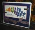
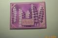
This was for the inspiration challenge today, which was an overhead satellite view of the Norweigan fjords. When I first saw it, I thought Paisley!!! in rich, deep colors, so here's my attempt. I am highly disappointed with the photo. After about 12 attempts between both my son and I and 2 different cameras, this is as good as we (he) got. IRL there is great contrast between the perfect plum and the night of navy, both of which are b/g stamped in paisley. It doesn't show well at all in the photo as compared to IRL. Oh well -- I tried the challenge -- so here it is --
Oh, I also thought the retired DD Fern looked kind of like the inspiration view of the fjords. Also, that is a rather odd spool of ribbon I picked up one time on sale, and I didn't think it would ever match anything, but it does go with this card fairly well, so that made me happy!
Date: Saturday, August 19, 2006 GMT Views: 1094
Favorited:20
Registered: July 17, 2005 Location: Staying inky in eastern Connecticut Posts: 79205
Sat, Aug 19, 2006 @ 5:18 PM
wowza.....you may take my fern crown away from me.....lol......this is awesome.....I love the 'rainbowish' inking and the ribbon.....you were truly inspired.....awesome
Registered: October 25, 2004 Location: Southern Oregon Coast Posts: 17641
Sun, Aug 20, 2006 @ 3:15 PM
This is gorgeous! Outstanding color choices for the Paisley to coordinate with the Late November spectrum pad--Plum and Navy--yum! Love the rainbow colored fern!