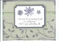
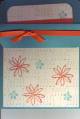
Boy, this challenge seemed so EASY, but when push came to shove, I had a hard time with this one. For Monday's Try A New Technique challenge, we were supposed to create a card in "a different light" than it was shown in the catalog, by using a different color scheme. This is a reproduction of the card found on pg. 187 og the catalog. Boy, did I have difficulties with this one because it's so UNLIKE anything I would ever put together. By that I mean, NO BACKGROUND stamp, NO DISTRESSING. My hands were literally SHAKING trying to hold themselves back from inking up the sides and aging the paper! Definitely a challenge for me. Thanks for looking!
Date: Tuesday, August 8, 2006 GMT Views: 878
Favorited:17
Registered: October 22, 2005 Location: Lovin' life in "The O.C." Posts: 13126
Tue, Aug 08, 2006 @ 2:49 PM
What's interesting to me about this card is that I never really looked at it in the catalog, but yours really caught my eye. It is unlike anything I would typically make, too, but after seeing your version, I think I am going to give this a whirl. I like your colors so much better and think this is a really great card. I love these ribbons, too, but have not used them much. Thanks for shedding new light on this and for inspiring me!
Registered: December 31, 2004 Location: Denver, CO Posts: 754
Tue, Aug 08, 2006 @ 3:22 PM
I agree with sarahstampart. I don't care for this card in the catalog, but your version pops out of the gallery. Love your colors and your take on this card. I'm a background-stamp-a-holic myself, but I love the simplicity and clean lines without any backgrounds, sponging or aging. TFS
Registered: March 31, 2005 Location: Texas Posts: 15635
Tue, Aug 08, 2006 @ 4:46 PM
Agree with those above. These colors popped out on the page and are so much prettier than the catty choices. I have to go looking for something to case this with now!
------------------------------ Sharon Today is a new day. Make the most of it ~ My meager beginning!
Registered: April 22, 2006 Location: Wisconsin Posts: 1340
Tue, Aug 08, 2006 @ 9:25 PM
I agree 100%! I like your version of the card much better than the sample in the catalog! I think it looks just find without a BG stamp. The simplicity is very elegant!
Registered: March 12, 2006 Location: Big Pool, MD. Posts: 5140
Wed, Aug 09, 2006 @ 8:25 AM
i know exactly how you feel. i never realized how little i look at the card samples until i had to study them for this challenge. so many of them are really blah!!! your case is much prettier than the original! i love the ribbons and colors you chose. i admire your restraint. lol!
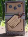
I love that you used different patterns on the ribbon...who says stripes don't go with dots?..and the little buttone and flower embellishments really tie it all together and add focus. this is very professional looking....catalog-worhty....Heidi