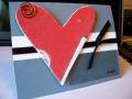
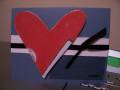
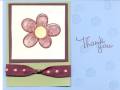
*I* really like this. My mother thought it needed something. I love the modernness of this card. I don't know... It's edgy. I'm not sure if it fits everyone else's style, but I loved how it turned out. I knew I had to put that heart on that paper!
Throw me some feedback either way.... I know I'll still like it!
~Kendra
Date: Tuesday, August 1, 2006 GMT Views: 831
Favorited:3
Additional Info
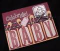
Stamps: Letter Patterns, Everyday Flexible Phrases
Registered: August 21, 2005 Location: in my own little world... they like me here! Posts: 5811
Wed, Aug 02, 2006 @ 7:38 AM
From what I can *see* I really like it. Your picture is a bit on the darker side.
The layout is nice and I like the ribbon placement. Do you have any wording or sentiment on it anywhere?
I think you did a great job on it! TFS!
------------------------------ Ren�e V
Stampin' Up! Demonstrator
Maybe it's because of the darkness of the photo (or maybe I'm in a sparkle mood) ~ but I wonder it a bit of sparkly stuff would be nice ~ or maybe some type of metal accent ~ silver ~ it's got an edgey modern feel...
Registered: June 20, 2004 Location: Queen of the Multi-task Posts: 5166
Wed, Aug 02, 2006 @ 9:09 AM
Great colors and layout! It does have a modern and edgy feel to it. Not sure about what it *needs* - if anything. Maybe dressing up the heart a bit more - but then it might lose the *feel* that you're going for. Maybe something subtle like Linen or Canvas on the BG or even on the heart too?? (Sorry I'm not much help) But overall it's very nice, TFS!!