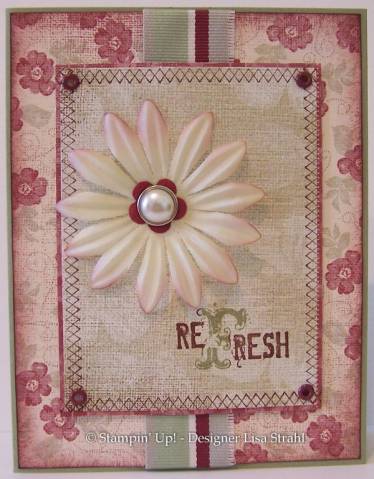
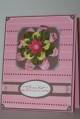
Word to the wise on this set. The large letter in NOT square to the rest of the word. I may try re-mounting and bending the rubber a little. As you can see, the *F* is straight, but the rest of the word is tipped up and looks the same in the catty. Interesting - I still LOVE IT!
The edge of the middle panel is from All in a Row, I am such an enabler for this set! LOL ;)
I cut off the navy section of the wide ribbon to match the color scheme.
...and I need the Cranberry now, the Bravo is just to dark.
Thanks for looking!
Date: Wednesday, July 12, 2006 GMT Views: 2021
Favorited:49
Registered: November 7, 2005 Location: Colorado baby! Posts: 5164
Wed, Jul 12, 2006 @ 2:45 AM
How funny, I can see it in the thumbnail and it's very similar to my card...and I didn't see yours first great minds! And, love the paper and the stitching!
------------------------------ Kelly aka "Stalking On Top Of the World"
Registered: August 9, 2005 Location: Tampa, FL Posts: 16812
Wed, Jul 12, 2006 @ 5:36 AM
This is beautiful, I think the Bravo looks great! But if you're set on the Cranberry, Ranger Inks makes a gorgeous Cranberry stamp pad. That paper is gorgeous, looks like a cross between silk and linen.
------------------------------ Jerri Kay My Gallery My Blog - A Touch of Grace Shout to the Lord, all the earth let us sing, power and majesty, praise to the King!


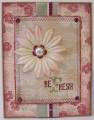

 great minds! And, love the paper and the stitching!


