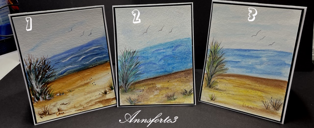
Wanted to see the difference using water color pencils, so did three similar scenes to see!
Card 1 - done with Newton & Windsor tube water colors on a textured panel.
Card 2 - used Primacolor Pencil Professional water colors on a textured surface. Didn't like this as much, harder to blend but the texture looks cool! Applied the color in layers to the sea and sand areas. Painting with pencils on the rough side of the water color paper is not for me!
Card 3 - used Derwent Professional water color pencils on a smooth surface. The colors blended very well and had a very soft tone to them. Struggled to get the rich color that I like in my paintings. I added five layers to the darker areas.
TFL!
Date: Wednesday, April 24, 2024 GMT Views: 479
Favorited:3
Registered: October 19, 2007 Location: Packer Country, WI Posts: 72174
Wed, Apr 24, 2024 @ 1:16 PM
Thanks for showing us the three examples. I like all three. Nice how you felt about each one of the mediums and what paper you liked best. I found that using the smooth hot press paper the paint stayed on top like there was a coating on the paper. You could move the paint for some time. It was difficult getting the vibrant colors from the pencils like you mentioned the five layers. I guess when we think about any water soluble medium, they have pros and cons. Thanks for sharing your experience with us.
Registered: June 4, 2009 Location: Deatsville, Alabama Posts: 83912
Wed, Apr 24, 2024 @ 4:49 PM
So cool you did these in different mediums/brands and showed us the difference. Each is lovely but my fave is on the left. I love you did a beach scene too. GREAT idea here. Hugz
------------------------------ Nancy Williams - Hope your day is Spirit-filled and ink-filled (in that order)!DRS Designs-DT, Punchkateerforever, Dirty Dozen Alumni
Registered: July 9, 2008 Location: Stars Fell on Alabama Posts: 75063
Wed, Apr 24, 2024 @ 7:36 PM
How great to see each one and how they worked with tubes or pencils and the different papers. I tried cold press first with my tulips but in the end the hot press worked much better for me. These are all super just the same.
------------------------------ My Blog---My Gallery---My PinterestI'm a Punchkateer! (Prez) FOREVERDirty Dozen Alumni2014 CAS Spring DT--- Inspiration Challenge Co- Hostess 12/02/17-12/28/19 Watercolor Wednesday Design Team Hebrews 13:2Brenda
Registered: February 5, 2007 Location: St. Louis, MO Posts: 92678
Thu, Apr 25, 2024 @ 3:55 AM
Ann, I really admire your take on this week's challenge. It took time to use three different mediums and different watercolor papers to create three similar paintings. I may be bias, but #1 is my favorite. Love its tonal shades in value...especially the "beach", it is gorgeous and has such depth. Your grass-work in all them is beautifully one. Thank you for this side-by-side comparison.
Registered: September 28, 2005 Location: NC,USA Posts: 1561
Mon, Apr 29, 2024 @ 10:46 AM
Thankyou for sharing your comparisons and describing how you achieved these effects. A wonderful example to refer back to. I find number #3 to be my favorite but all are so lovely.
------------------------------ Happy Crafting, SuZ FS818 Proud Fan Club Member