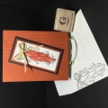
This is what inspired me for this card: https://www.pinterest.com/pin/277112183309607811/
Do I need to buy more paper? Of course not. But I couldn't resist the 6x6 floral elegance pad from Crafter's Companion. Beautiful florals and the paper has a sheen to it.
This is also for yesterday's MIX. Dina challenged us to use the newest Pantone color: peach fuzz. This is the pattern that drew me in:https://www.spoonflower.com/en/wallp...peel_and_stick
Years ago, I chose a wall color for my living room and dining room very similar to the range of peaches in my watercolor ombre background, which was quite fun to paint. The wall paint was called 'pheasant' and even though it looked very orangy-peach on the paint strip, it was a lovely, warm neutral color that went with a lot of decor. I had just bought a peach watercolor tube and had to try it. As I got further down, I started to add a little brown and the bottom strip is a bronze metallic.
Then I mixed a little light violet acrylic paint with the embossing paste because it seemed like some of the fabric samples Dina showed us had a sort of dusty lavender. Maybe just my eyes, who knows. I scraped it through a stencil and added a little peachy/salmon glitter. That was the easy part; the rest was very much 'make it up as I went' until I discovered my inspiration piece.
The sentiment is by John Muir, who immigrated from Scotland as a child and settled in Portage, Wisconsin with his family. I pass Portage on the way to LaCrosse from my former home. I think it's so cool that the Muir family settled here but if you're a nature lover, this is a good place to start. He attended the University of Wisconsin-Madison but never graduated because he took such an unusual array of courses. He was listed as 'an irregular gent' because of that. Thought that was a fun fact.
I enjoyed all the florals and pretty ideas today.
Date: Saturday, April 6, 2024 GMT Views: 537
Favorited:0
Splitcoast Dirty Dozen Splitcoast Challenge Hostess Teapot Tuesday TEAm
Registered: January 19, 2014 Location: Central Indiana Posts: 91162
Sat, Apr 06, 2024 @ 10:39 AM
Your card is a beautiful reflection of the inspiration you found in the floral elegance pad from Crafter's Companion. The mix of colors and textures, inspired by the peachy tones of the Pantone color and your wall paint, creates a lovely harmony, and the addition of the sentiment by John Muir adds a thoughtful touch. It's fascinating to learn about the connections between your creative process and personal experiences, making your card even more meaningful.
Splitcoast Dirty Dozen Alumni SCS Gallery Moderator Splitcoast Challenge Hostess Teapot Tuesday TEAm
Registered: July 27, 2007 Location: Dublin, Ireland Posts: 132008
Thu, Apr 11, 2024 @ 11:14 PM
I had to look up the DP. I would find the darker sheets hard to use but as an accent piece it looks wonderful, like a big painted button. I'm a big fan of glitter with thick paint or embossing paste, alas I rarely think of tinting my paste.