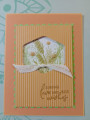
Wanted to play with the challange today, but didn't have the exact colors. I have a lot of OLD stock to use up before I can buy new. Here is my submission for CC983. I am not too sure about this one, think it is a little too orangy. I do like the focal point and sentiment through. Thanks for looking.
Date: Tuesday, January 16, 2024 GMT Views: 299
Favorited:1
Splitcoast Dirty Dozen Alumni Splitcoast Challenge Hostess The Charmed Life
Registered: November 19, 2005 Location: Bethel Park, Pa Posts: 37265
Tue, Jan 16, 2024 @ 2:11 PM
this is a pretty card and your color subs are fine -we encourage stampers to use what they have that is close to the colors listed. Thanks for playing along with us this week.
------------------------------ Mary Marsh SCS Color Challenge DT Coordinator My Blog- The Charmed Life
Splitcoast Dirty Dozen Creative Crew SU Design Team Alumni Splitcoast Challenge Hostess
Registered: November 28, 2004 Location: St. Paul, Minnesota Posts: 11240
Tue, Jan 16, 2024 @ 4:20 PM
Beautiful! I haven't really seen a lot that I'm crazy about with those postage dies but I think you've done here with the colors is the best I've seen. It lends a fun and different look in these warmer colors.
Splitcoast Dirty Dozen Splitcoast Challenge Hostess Proud Fan Club Member
Registered: September 24, 2007 Location: WA Posts: 14006
Wed, Jan 17, 2024 @ 2:54 PM
Well, I love the colors and I don't think it's too orangey at all! I especially like the hexagon-shaped window opening with the pretty grasses and the enamel dots!
------------------------------ Barbara Splitcoast Dirty Dozen My website: Inky Fun SCS Fan Club Member Color Challenge Team Member QFTD215