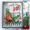
Pebbles and Wheat and Lagoons...Oh My! Chris has sent me on a true Color Challenge this week. I don't have SU supplies but I have always had inks and cs that at least came close. Not so this time, but here's where I landed.
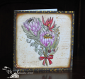
The main panel is a lot of ink blending (Hickory Smoke, Frayed Burlap, Hickory Smoke, Antique Linen, Hickory Smoke) and then embossed. I initially tried just the Hickory Smoke but it was way too cool and the wheat really didn't love it. The browns helped to warm it up a bit and the wheat was much happier. The rest is stamp, cut, color and glue. I added the scallop border for dessert. I colored the scrapper's floss with COPICS to add a bit more of the wheat color. Some of the leaves and the velum leaves were leftovers from other projects so I don't remember which stamps/dies I used back then.
I am not versed on color theory so I wish I had had some actual Pebble Path ink or cs to get it truly right. I think the warmer tones of pebble path would blend so much more beautifully with this shade of yellow than my cooler gray does. Don't get me wrong, my card is fine; it would just have been better with the actual color.
I do so love the soothing, Zen feel of this palette and it makes me I wish I had some Asian themed stamps, especially something like an Ikebana arrangement. At least I had some lovely flowers that give me a comforting feel. I hope you will join us this week. I would love to see how these colors inspire you. TFL
Date: Monday, October 9, 2023 GMT Views: 553
Favorited:0
Registered: August 9, 2006 Location: Central Oregon Posts: 2093
Mon, Oct 09, 2023 @ 8:03 PM
Oh, this is beautiful Debbie! I love your grey for pebbled path and that blue looks very close to Lost Lagoon. Love your scalloped border. Such a pretty and soft card.
Splitcoast Dirty Dozen Creative Crew SU Design Team Alumni Splitcoast Challenge Hostess
Registered: November 28, 2004 Location: St. Paul, Minnesota Posts: 11240
Mon, Oct 09, 2023 @ 8:26 PM
I so love your interpretation of these colors and your explanation of getting to the "Pebbled Path" was so interesting to me. Card making is the best when we get inky, right!
Splitcoast Dirty Dozen Creative Crew SU Design Team Alumni
Registered: January 7, 2007 Location: Southern California Posts: 42922
Mon, Oct 09, 2023 @ 8:54 PM
I am shocked at how much I love your choice of a grey base. The florals look amazing against it. And you are right- these colors are a bit calming and Zen. Now for me to create something!
------------------------------ Kathy Stamp n Sip with me
Registered: October 12, 2007 Location: Arizona Posts: 70737
Tue, Oct 10, 2023 @ 7:30 AM
Beautifully done! Love the flowers and the vellum & Wild Wheat stems behind. The scallop edge is fabulous. Love the pearls! Wonderful ideas and fabulous use of the challenge colors.
Registered: August 21, 2007 Location: Wayland MA Posts: 105275
Tue, Oct 10, 2023 @ 10:09 AM
Lovely flowers, lovely coloring. GReat design.
------------------------------ Anne HarmonFS154, QFTD58, PROUD FAN CLUB MEMBER (photo of our Great Granddaughter Elise, just 6 months old) and me, even older.
Wow, Debbie, this is really lovely! The flowers are beautiful and I love the wheat, gray and vellum leaves! The texture and scallops are wonderful accents!
Splitcoast Dirty Dozen Splitcoast Challenge Hostess Proud Fan Club Member
Registered: September 24, 2007 Location: WA Posts: 13991
Tue, Oct 10, 2023 @ 1:37 PM
How absolutely lovely, Debbie! Your color choices are perfect, and your Copic coloring is superb. I especially love the scallop border, which seems to echo the curves of the floral image. I also would like to thank you for the heartfelt comments you always leave for me. So much appreciated!
------------------------------ Barbara Splitcoast Dirty Dozen My website: Inky Fun SCS Fan Club Member Color Challenge Team Member QFTD215