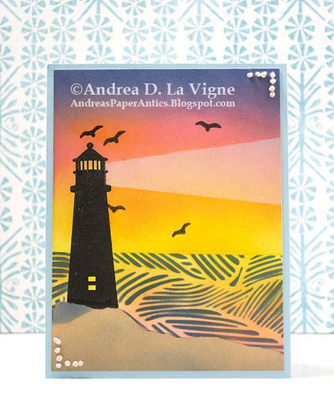
This card took quite a bit of pre-planning & also focus while I was making it. Thankfully, I was able to use the masks from the Waffle Flower set to help me determine where to position everything before I started stenciling & stamping.
Once I had my design worked out, I began by ink blending the sand area. I used Antique Linen first, and then darkened/warmed it with Tea Dye. I added Chipped Sapphire over the area to the far left, just to differentiate that spot & make it look "rocky."
I positioned the sand & lighthouse masks, & then ink blended the sky. That was probably the easiest part of the whole card! After I had all the colors down, I added the light beam with that stencil & Yeti ink.
For the water area, I taped the "Waves" stencil in place, & masked above it with yellow Frog tape. I ink blended with the same colors as the sky, minus the Chipped Sapphire. Then I removed the stencil. The white areas seemed a bit too stark, so I blended over them with the same colors to try & get a tone-on-tone effect. That didn't give much contrast, though, and the colors actually looked kind of "mushy." So I positioned the "Waves" stencil back where I had had it, & inked over it with Chipped Sapphire, making sure to go dark enough that it covered the underlying colors, rather than just blending with them. It's a rather stylized look, but I think it came out OK.
I removed just the lighthouse mask, & stamped the lighthouse with black ink. I stamped it about 3 times, just to get a good solid coverage. The area right above the sand mask didn't really stamp, but fortunately I was able to use a black marker to fill in the missing part. I also stamped the birds in black. I used the stencil to add the light in the windows. I blended yellow & pink ink to the top part where you can see through the glass to the sky behind. To add a little something in the corners, as per the Teapot Tuesday challenge theme, I pierced holes & made French knots with a pale rose embroidery floss. Finally, I matted the panel with blue cardstock & adhered it to a white card base. I decided a greeting on the front would detract from the scene, so I'll just write a personal message inside.
Date: Thursday, August 31, 2023 GMT Views: 238
Favorited:0
Registered: February 19, 2011 Location: Fullerton, CA Posts: 15255
Sat, Sep 02, 2023 @ 3:18 PM
Wow, your description sounded like a lot of work, but what a glorious card you got from it. I adore the ink blending throughout, but that sky is phenomenal both because of the colors and because of the blending. That light beam really makes that scene come alive. Fabulous card.


 After I had all the colors down, I added the light beam with that stencil & Yeti ink.