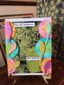
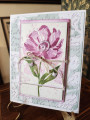
This came together very quickly and easily because I used three stash backgrounds: the background is made with strong coffee, I scored it and rubbed some milled lavender on it; the main image is stamped and embossed on a background that I have no idea how I did, very speckley; the small image of the teapot is stamped and embossed on an ai background. Isn't it interesting that I used the same ink for both but they look like different colors? Different paper I guess.
I was influenced by both, which is why I scored the background, used the teacup and teapot theme, flowers, small embellishments. Mine is a little more whimsical and grungy. Enjoy your week, Pam; I could keep going because of all the cute and pretty cards you have made. Thanks, Julie!
Date: Sunday, February 19, 2023 GMT Views: 422
Favorited:0
Registered: May 25, 2006 Location: So. Oregon Posts: 121800
Sun, Feb 19, 2023 @ 12:43 PM
that is cool, I know some of the purples turn pink for me too and I never really thought about the paper, figured it was the water. Love the textures this has Jean.
Registered: June 4, 2009 Location: Deatsville, Alabama Posts: 82660
Mon, Feb 20, 2023 @ 3:10 AM
Relaxing and very cool card, Jean. The different colors from the same ink is very interesting - at least they match well as they are from the same ink and same type of theme. Lovely case. Hugz
------------------------------ Nancy Williams - Hope your day is Spirit-filled and ink-filled (in that order)!DRS Designs-DT, Punchkateerforever, Dirty Dozen Alumni
Registered: February 19, 2011 Location: Fullerton, CA Posts: 15023
Mon, Feb 20, 2023 @ 1:33 PM
Whimsical is the perfect descriptor for this delight. That "spa" tea cup with all those great blooms is so fascinating to me. Reminds me so much of your zentangle cards and style. Love the scoring on the base layer. Adds great interest. Fabulous and fun.


 Love the textures this has Jean.


