This is my sample for CC909. Jeanne is our hostess and she chose daffodil delight, polished pink and orchid oasis for her color trio. Dessert option this week is summer.
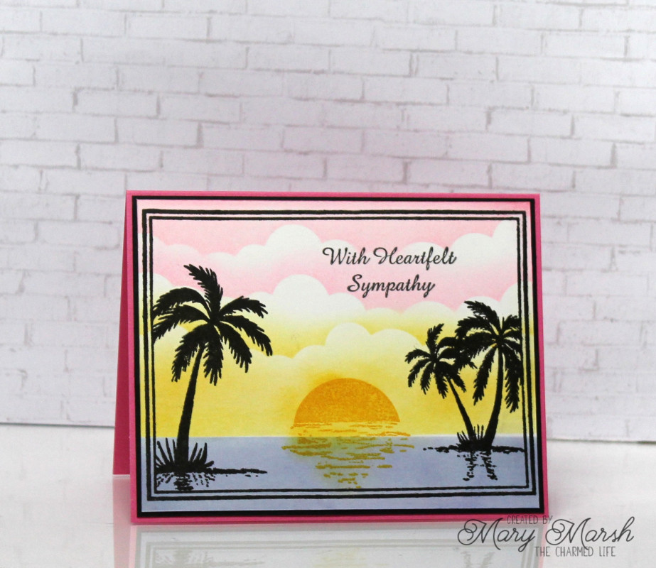
I unfortunately needed a sympathy card for a friend who just lost her husband. I used a stamp set from Gina K for the frame, palm trees and sun. I thought the setting sun would work for a sympathy card.
I used a variety of distress inks to create my background. The clouds are done in kitsch flamingo, squeezed lemonade and wild honey.
For the water I blended shaded lilac, wilted violet, stormy sky and faded jeans to get a color close to orchid oasis. Thanks to Barbara for helping me out here.
Hope you can play along with us this week. Jeanne has chosen some bright colors for your summer themed cards.
Splitcoast Dirty Dozen Splitcoast Challenge Hostess Proud Fan Club Member
Registered: September 24, 2007 Location: WA Posts: 13991
Mon, Aug 15, 2022 @ 10:31 PM
Always sad to need a sympathy card, but what a lovely one you created here, Mary! I agree, the setting sun is a perfect metaphor for the end of a life. You did great on mixing colors for the sea!
------------------------------ Barbara Splitcoast Dirty Dozen My website: Inky Fun SCS Fan Club Member Color Challenge Team Member QFTD215
Registered: October 12, 2007 Location: Arizona Posts: 70705
Tue, Aug 16, 2022 @ 6:28 AM
Beautiful and peaceful scene. Love how you used the challenge colors for the sky, setting sun and the water. The palm tree silhouettes are terrific. So sorry you needed a sympathy card. This one is lovely.
Registered: December 30, 2012 Location: Southern California Posts: 1269
Tue, Aug 16, 2022 @ 9:03 AM
This is really a beautiful card. The sunset scene in those colors look tranquil and calm. Perfect for a sympathy card. So sorry for your friend's loss.