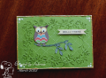
Looking at any uploads I've seen so far, they seem to make more of a focal point of the double embossing. The two folders I used lend themselves more to being a background. The owl could do with being a bit lower, but it's too late to change him.
I embossed and sanded the trellis, then embossed the leafy frame and swiped over it with Peeled Paint. The archival pads are good for that, being so firm. Added my owl perched on a branch with white pen highlighting. Sentiment strip popped up on foam. I edged the panel with Liquid Pearls in a yellow, probably Canteloupe, which sort of matches the paper I used to stamp the sentiment and for the largest circle in the owl's eyes. I added Glossy Accents to his beak.
Date: Monday, March 14, 2022 GMT Views: 785
Favorited:3
Splitcoast Dirty Dozen Splitcoast Challenge Hostess Teapot Tuesday TEAm
Registered: June 3, 2016 Location: France Posts: 60508
Mon, Mar 14, 2022 @ 12:36 PM
Your folders are beautiful together and you've created a pretty background for your fun owl, I don't think the owl needs to be lower, in a forest branches are high, low and everywhere so that doesn't disturb, I love your green!!
Registered: November 7, 2006 Location: Willamette Valley Oregon Posts: 34508
Mon, Mar 14, 2022 @ 10:39 PM
I think your owl is just right all front and center. So many interesting tidbits here. All the green hues and the embossed textures! Everything keeps the eye focused on the patterns…
------------------------------ Susan~~~One4Joydaily I'm a FAN CLUB member, U? MY GALLERYof visual Delights MY BLOG