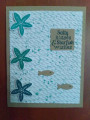
Used the dark color (Bay Breeze) for the sentiment and eyes of small fish. Used mid-tone color (Sea Glass) for ink splattering - swiped some color from the ink pad onto an acrylic block, added water to get a looser consistency, then used a small brush to flick the color off the block in a downward motion onto the card (be sure to do this away from the rest of your project to prevent a mess, I used an old shipping box as a splatter box to catch any wayward droplets). I actually had it in my mind ahead of time to splatter the kraft background piece and have some dots of color around the edges but wasn't paying attention and wound up splattering the white piece. The splatter came out great, but I feel hides a bit of the rope pattern embossed on the white. I still love the card. Just goes to show that mistakes can be salvageable - a card can still be worthwhile even if the end result does not match your original vision. The recipient will be none the wiser and will still appreciate the gesture. I think as creators, we can sometimes be too hard on ourselves.
Date: Thursday, September 16, 2021 GMT Views: 324
Favorited:2