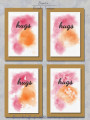
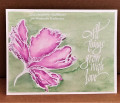
Design influenced by Splitcoaststampers WCW055 | "hugs" | Digital Project | Four cards are on this set. All have the white watercolor paper over the light linen Kraft panel. The two watercolor splotches are the same color but have different filter. But have the Inkscape watercolor filer applied first. Inskscape's watercolor is very hard to use because it will not stay in the lines very easy. That is why I rarely use this texture in most watercolor cards. Some you might have a favorite of the four card images. | Created via #Inkscape | Poster: brentsCards
Special: white watercolor paper, brushes, water mister
=================================================
Kraft light linen | (from bottom):
1. Base: Kraft plain 5 x 7 with thin Basic Black border
2. Light Linen: Smoky Slate with Opacity (14%) and Filter (Dots Transparency, Linen Canvas)
White Watercolor Paper with Four designs | (from bottom):
1. Base: Basic White with thin Basic Black border [shadow]
2. Color 1: Melon Mambo with Filter, as follows:
Option 1 (upper left): Water Color
Option 2 (upper right): Water Color, Dots Transparency
Option 3 (lower left): Water Color, Speckle
Option 4 (lower right): Water Color, Frost
3. Color 2: Pumpkin Pie with the same filter as above
4. Text Base: Basic Black plain
5. Text Texture: Base: Basic Black with Opacity (20%) and Filter (Cracked Lava)
6. WC Paper Texture: Smoky Slate with thin Basic Black border, Opacity (8%) and Filter (Smart Jelly, Paper Bump)
[shadow]: Filter (Drop Shadow)
Date: Wednesday, June 16, 2021 GMT Views: 719
Favorited:2
Registered: February 23, 2016 Location: El Paso, TX Posts: 23018
Wed, Jun 16, 2021 @ 3:26 PM
Giggling a bit at your write-up Brent . . . and the fact that you don't use the watercolor feature of Inkscape because it won't stay in the lines . . . . which is exactly what watercolor applied with a brush tends to do! (not stay where I want it - lol)
My personal fav's of your set are the 2 on the left hand side because they most resemble a spritzed and painted bg.
------------------------------ Linda aka Bubbles
I'm not a Hoarder . . . I'm the Curator of an extensive collection of embellishments!!
Proud Fan Club Member Guest Designer Color Challenge July 2017 Favorites Notification Team
Registered: July 9, 2008 Location: Stars Fell on Alabama Posts: 75073
Wed, Jun 16, 2021 @ 7:12 PM
Fabulous cards, Brent. I love that ink moving around wherever it wants....(or, at least, most of the time) . Ha Great cards to send to some special people.
------------------------------ My Blog---My Gallery---My PinterestI'm a Punchkateer! (Prez) FOREVERDirty Dozen Alumni2014 CAS Spring DT--- Inspiration Challenge Co- Hostess 12/02/17-12/28/19 Watercolor Wednesday Design Team Hebrews 13:2Brenda
Registered: November 24, 2013 Location: NYC Posts: 17745
Thu, Jun 17, 2021 @ 4:49 AM
I like them all. I can see where WC which often refuses to behave itself, certainly in any kind of exacting way, might irritate a graphic person. But that can be the point of WC-a dreamy effect. Which you achieved!
These came out lovely. I might like the two on the right a bit better.
------------------------------ Margot
I am a proud fan club member