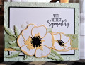
For Shirley's sympathy card challenge. I was going to buy a sympathy card I needed, but then found a great design by Jamie (Stamp It Up With Jamie). (Awesome teaching about how to make this). Thank you Jamie:
I just changed a few things with diff. e.f., dp, and the addition of a stitched scallop strip.
Date: Saturday, February 13, 2021 GMT Views: 1155
Favorited:6
Registered: June 27, 2012 Location: Washington Posts: 25246
Sat, Feb 13, 2021 @ 5:06 PM
Its been so long since I've been in the gallery commenting, that I'm just making visits to friend galleries to catch up. I'm panning the galleries and choosing card that pop out at me back several months. Here is the first one of yours that popped!
The colors seems to just jump out at me...so pretty...soft yellow and greens. This makes a lovely sympathy card and the embossed background really adds great texture!
------------------------------ Carlene aka Chatterbox-1--My BLOG; My Pinterest;My SCS Gallery; FAVORITES Team Member; 2022 Christmas Card Challenge 75/105. My SCS Goal: Challenge Catch-up; Sketch Challenge Sample Card Team (August 2022--January 2023).
Registered: March 20, 2008 Location: Hamilton, Ontario Canada Posts: 615
Sun, Mar 14, 2021 @ 8:22 AM
I have wanted to purchase layered floral dies like you have used here, but I haven't found exactly what I'm looking for--this set looks much more like what I'd want as you have made it look so realistic. I particularly like how you have kept the inside of the petals white and only colored the outline in saffron (I have always thought that So Saffron was such an elegant color of cardstock as it is here), and the black center really makes the petals pop, gorgeous! The green cs you've used for the various layers of the leaves is lovely, and pairing this with the strip of green patterned paper plus the light green with that tiny embossed pattern layer below is gorgeous. I am blown away at how stunning is this wonderful sympathy card, wow!!! It's absolutely gorgeous!!!
I love your color combination, you really know how to balance colors well, something that I need to work on, and I appreciate being able to learn from you.