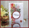
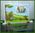
Such a lovely site for the Splitcoast Inspiration Challenge! While I loved all the pretty items, I found it was tough for me to pick, because almost everything is in whites or pastels. For the most part, Iâm just not a pastel person. I was really in the mood to make a fall card so when I saw THIS cookbook cover, thatâs what I chose. They looked more like fall colors & the white circle was perfect for a greeting.
For my card, I started by white embossing the leaves onto a narrow strip, then sponging the fall colors over it. Then I white embossed them again on separate pieces of green & rust colored card stock & fussy cut those. The white bg was dry embossed & I popped up the greeting on its own circle. The circle stitch frame behind the greeting was sponged to match the leaves.
Thanks so much for looking. It's on my blog w/ closeups & product links: The Write Stuff
Date: Friday, August 28, 2020 GMT Views: 969
Favorited:7
Registered: May 25, 2006 Location: So. Oregon Posts: 122096
Fri, Aug 28, 2020 @ 7:43 PM
ha, I even seen leaves in the bowl of ( what ever it is) on the cover, totally perfect for a fall jump start Julie. love the vibrancy of the colors here.
I love how the cover of the cookbook inspired your beautiful Fall card! Your heat embossed leaves are beautiful and I like the dry embossed leaves in the bg.
Registered: August 21, 2007 Location: Wayland MA Posts: 105272
Sat, Aug 29, 2020 @ 7:19 AM
The white embossing is beautiful, Julie!
------------------------------ Anne HarmonFS154, QFTD58, PROUD FAN CLUB MEMBER (photo of our Great Granddaughter Elise, just 6 months old) and me, even older.


 love the vibrancy of the colors here.


