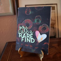
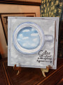
This was my first background and it was rather disappointing until I put on a layer of black. My colors were yellow, blue and red; the yellow and blue made green, even though the paint was dry. I was much happier after adding the black but it certainly isn't as clean as the other card.
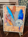
I used the Milky Pop pen to add dots around the circles and two diecuts, the heart is from a leftover paint scraped background.
I hope you join me for this TLC challenge. I thought it was interesting and fun. Thanks to Pat (pvilbaum) for telling me about it.
Date: Sunday, August 9, 2020 GMT Views: 871
Favorited:2
Splitcoast Dirty Dozen Splitcoast Challenge Host Proud Fan Club Member
Registered: April 11, 2016 Location: Posts: 30054
Sun, Aug 09, 2020 @ 10:17 PM
Looks a fun technique. Great card. TFS. Happy day
------------------------------ The Difference Between Try and Triumph Is Just A Little Ump Wednesday: Alpha Challenge
Thursday: Ways To Use It Challenge
Monthly: MMJ Challenge….get inky and have fun
Splitcoast Dirty Dozen Alumni SCS Gallery Moderator Splitcoast Challenge Hostess Teapot Tuesday TEAm
Registered: July 27, 2007 Location: Dublin, Ireland Posts: 132040
Tue, Aug 11, 2020 @ 3:34 AM
Ah - now I would look at this and say that dark works much better. We each have our own ideas of what looks right - just as well. Again, I like the dotted white outlines, great idea.