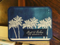
This started off as a CASE, but then it went south kinda fast. So, I took a different route. I was trying to do an ink smooshing BG, but the color was not what I was wanting. I was getting frustrated and tried adding some Navy ink. Then, I just covered the whole thing. Some of the colors underneath still peak through - so that's fun. I have had a small strip of this darker Navy in with my latest pack of Navy paper. I wonder if it is just a difference in batches. I guess I'll find out when I order some more soon...
Date: Tuesday, July 14, 2020 GMT Views: 1178
Favorited:5
Registered: April 16, 2008 Location: Meridian, Idaho Posts: 8507
Tue, Jul 14, 2020 @ 10:45 PM
I like the sky colors you needed up achieving, the embossed palms are such a wonderful contrast! Sometimes it's our failed attempts that turn I to the most lovely results, like this beauty!
------------------------------ Stef
Splitcoast Color Challenge Design Team Splitcoast Dirty Dozen Alumni
Registered: June 4, 2009 Location: Deatsville, Alabama Posts: 83326
Fri, Jul 17, 2020 @ 4:01 AM
Wow, the Navy looks just so fab on this!!! Wonderfully done and so cool! Hugz
------------------------------ Nancy Williams - Hope your day is Spirit-filled and ink-filled (in that order)!DRS Designs-DT, Punchkateerforever, Dirty Dozen Alumni
Registered: March 13, 2011 Location: Langley, B.C. Canada Posts: 32115
Fri, Jul 17, 2020 @ 11:54 AM
Love these white embossed palm trees with the blue gradient background look. (I hear ya on the frustration though, as it sounds like what I go through lots of times). I just love that sentiment!
Splitcoast Dirty Dozen Creative Crew SU Design Team Alumni
Registered: January 7, 2007 Location: Southern California Posts: 42852
Tue, Jul 21, 2020 @ 3:12 PM
It's interesting to find out how you got to your final card. I LOVE the background even though it was not by design. The end result is stunning with the navy and gold contrasting in a great way.
------------------------------ Kathy Stamp n Sip with me


 No matter what you call it, it is pretty.