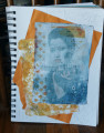
Playing along with Dina's Mixability Challenge to use opposites on the color wheel. I chose blue and orange because I had already been playing around with oranges on my Gelli plate this week. I used blue Stazon for my image transfer with Pewter as the acrylic to activate it. I stenciled a bit of orange over it. I took another orange print and tore it's edges and layered over a crumpled orange piece. This went into my art journal with some.illegible writing added here and there. The print has pastels, Gelatos and colored pencils to add more definition .
Date: Friday, February 14, 2020 GMT Views: 367
Favorited:2
Splitcoast Dirty Dozen Alumni SCS Gallery Moderator Splitcoast Challenge Hostess Teapot Tuesday TEAm
Registered: July 27, 2007 Location: Dublin, Ireland Posts: 131535
Fri, Feb 14, 2020 @ 11:18 AM
Gail, you do amazing work with those image transfers. I take my hat off to you. Funny that you and Susan used the same colours and are beside each other. This makes me want to try blue and orange.
I like the illegible writing in the background.
Registered: August 15, 2007 Location: Twin Cities MN Posts: 50473
Fri, Feb 14, 2020 @ 1:42 PM
I agree with Sabrina...you have got the transfer technique mastered! This is great...I love this color combo...almost went with it for my card today. I like how you added some extra color with gelatos and pencils.
Registered: November 7, 2006 Location: Willamette Valley Oregon Posts: 34503
Fri, Feb 14, 2020 @ 10:05 PM
I am agreeing with Sabrina and Polly...I'd thought of the illegible bg before I'd read their comments...but also the transfer technique. I have NOT master that. Wonderful journeying work, Gail.
------------------------------ Susan~~~One4Joydaily I'm a FAN CLUB member, U? MY GALLERYof visual Delights MY BLOG