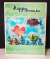
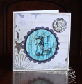
For today's sketch, I used Monday's TLC for the main image. A little wider than the sketch but...I used stars for the piece underneath.
As far as the TLC went, I made two poor choices: iridescent matte medium and the blushing bride reinker. That matte medium doesn't dry clear, it's translucent and the bridal pink was too dark. It came out more coppery in color than pink. I couldn't use a stamped piece underneath, so I put some diecut stars on top. Then the industrial started. I used a piece of adhesive bronze metallic that is supposed to be used for covering a switch plate. I thought it was neat, bought it long ago. I like the bronze and silver together. I hope you can see the outline of the tree, it's kind of Dr. Seuss-y.
Date: Wednesday, December 4, 2019 GMT Views: 708
Favorited:3
Registered: January 6, 2004 Location: Connecticut Posts: 20543
Wed, Dec 04, 2019 @ 8:12 PM
Really interesting and lovely card. I like the Dr. Seuss feel to the tree!
------------------------------ Rediscovering the simple joy of stamping and exploring my art! Stamp your ART out! Share your thoughts. Let your heart sing.
Come check out my Gallery and leave a comment!
FS465
Splitcoast Dirty Dozen Alumni SCS Gallery Moderator Splitcoast Challenge Hostess Teapot Tuesday TEAm
Registered: July 27, 2007 Location: Dublin, Ireland Posts: 132008
Thu, Dec 05, 2019 @ 1:21 AM
I can see the tree, and it is very Seuss. The sentiment font is a great fit with it.The metallics look so rich. This has a super masculine feel.
I think it takes a VERY light hand with reinkers for a stamped design to show underneath. I was quite surprised that my first attempt didn't work out, it was a silhouette tree stamped in very dark green, and though I didn't think my reinkers were that dark, not a trace of it was visible under the tissue and acetate. But hey, just the coloured tissue and no stamping at all was one of Beate's options.
Registered: February 23, 2016 Location: El Paso, TX Posts: 23018
Thu, Dec 05, 2019 @ 9:50 AM
My "blushing Bride, always seems dark, too, coppery verging on brown and not at all like the color swatch . . . I like the look with the coper and silver paired. (must admit, I didn't catch the silhouette tree shape until I read your description then it popped right into focus.
------------------------------ Linda aka Bubbles
I'm not a Hoarder . . . I'm the Curator of an extensive collection of embellishments!!
Proud Fan Club Member Guest Designer Color Challenge July 2017 Favorites Notification Team
Registered: January 20, 2010 Location: Brampton, Ontario Posts: 26216
Thu, Dec 05, 2019 @ 4:06 PM
I saw those marvellous trees right away! They look great with your array of stars. I agree with Sabrina - this has a great masculine feel. Would be perfect for my 20 something nephews!