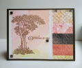
For three challenges...a simple card. I did the color challenge, this is how the three colors look when they are combined in a background. The tranquil tide takes over a bit. This is for Amanda, our teapot challenge recipient. I used Dew Drops as my favorite embellishment; I like them because they are clear. The ones I used are a very pale blue.
PS I couldn't find a gallery for the SU stamp set.
Date: Tuesday, April 23, 2019 GMT Views: 1396
Favorited:2
A simple card is what I love best. But there's simple and then there's simply beautiful, which yours is. So peaceful looking. And I love the deckled edge on the window. This is a beauty!
Registered: July 9, 2008 Location: Stars Fell on Alabama Posts: 74580
Tue, Apr 23, 2019 @ 12:39 PM
I love the design of your card and the blues are so pretty.
------------------------------ My Blog---My Gallery---My PinterestI'm a Punchkateer! (Prez) FOREVERDirty Dozen Alumni2014 CAS Spring DT--- Inspiration Challenge Co- Hostess 12/02/17-12/28/19 Watercolor Wednesday Design Team Hebrews 13:2Brenda
Splitcoast Dirty Dozen Alumni SCS Gallery Moderator Splitcoast Challenge Hostess Teapot Tuesday TEAm
Registered: July 27, 2007 Location: Dublin, Ireland Posts: 131363
Tue, Apr 23, 2019 @ 2:05 PM
Very clever use of negative for the CAS challenge. I like the flight of birds almost as if they're flying out of the tree. I like Dew Drops too, I just wish they were easier to mail.
Sets in the current mini are always located in a separate group together, apart from the regular alphabetical groupings. It's SU Minis & Creative Crew for the first drop-down menu, about 8 down from the top.