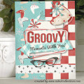
Just straight stamping on this card. I love the distress oxide inks though because you can get a good solid image so easily. I only have four colors in these pads so far, but I love them and want more. I thought these colors would work well for a vintage/funky feel especially when used with a dark brown. I added the gold to get more of the 70's feel. The word is die cut twice and the black layer underneath gives it a tiny shadow and gives the one-layer card a little dimension.
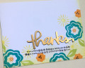
The retro color combination and the placement of your pretty florals are awesome! Great CAS design! Thank you so much for joining us at The Flower Challenge!