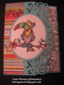
This card is not yet put together. Should it stay as is? Should I use a softer color for the bg and ribbon? Should I junk it and start again? No mojo today, I guess.
Date: Monday, June 25, 2018 GMT Views: 344
Favorited:2
Registered: February 23, 2016 Location: El Paso, TX Posts: 22824
Mon, Jun 25, 2018 @ 5:43 AM
I rather like your signature red framing & bow. (a lighter color might tend to make the whole thing look 'washed out'.) I usually lay out 8 or 10 different colors and often I am VERY surprised at what make the focal image pop. Love that border punch - it really makes an attractive frame.
------------------------------ Linda aka Bubbles
I'm not a Hoarder . . . I'm the Curator of an extensive collection of embellishments!!
Proud Fan Club Member Guest Designer Color Challenge July 2017 Favorites Notification Team
Splitcoast Dirty Dozen Splitcoast Challenge Hostess Proud Fan Club Member
Registered: January 27, 2010 Location: Southern Ontario, Canada Posts: 51725
Mon, Jun 25, 2018 @ 6:01 AM
You know what Anne, whatever makes you happy works for me. If you are not happy with the look, try a lighter background and ribbon colour ... then see if it makes you smile. I am going to come back later and see if you changed anything.
Registered: June 29, 2004 Location: Sugar Land. Texas Posts: 79473
Mon, Jun 25, 2018 @ 6:26 AM
Perfect already. Love the subtle drops in the background.
------------------------------ LizThe joy of the LORD is my strength.Right Brain Madness --My blogProud member of the redDivasKSS certified multi-step stamperFan Club member since 2004
Registered: June 2, 2008 Location: Michigan Posts: 60274
Mon, Jun 25, 2018 @ 7:58 AM
Love the ribbon treatment and framing. Since you’re looking for suggestions: I would use a darker color for the dress and a lighter shade for the background.
------------------------------
Miss Boo - a.k.a. jen70
SCS Fan Club Member since 2005
Retired Challenge Hostess (2005-2014)
Limited Supplies, Featured Stamper, Clean & Simple
Registered: August 15, 2007 Location: Twin Cities MN Posts: 50473
Mon, Jun 25, 2018 @ 9:44 AM
I like the layout...maybe a different color bg as it's similar to the color of the dress...I don't know...I agree with others who say try a couple of different things and see which color looks the best. The main thing is...you made a card today ;)
Registered: January 20, 2016 Location: Freetown, Massachusetts Posts: 31437
Tue, Jun 26, 2018 @ 3:13 AM
I think it's lovely. I really like the color combo having been born on Flag Day, red white and blue is a favorite of mine. So if you think it needs something more what about a tiled light blue panel peeking out from under the white one? I really love the paper clip and ribbon. I felt like I was having mojo issues yesterday too. Couldn't even get around to posting either of my cards yet. Maybe it's the weather--except it's finally beautiful out!