Registered: October 21, 2010 Location: in the okanagan in b.c. canada Posts: 13012
Mon, Mar 05, 2018 @ 1:39 AM
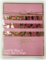
Your pink base looks so well framing your beautiful flowers. I like the added bling....which reminds me I have no sparkles on my card...Must be late..Thanks for sharing...:0)
------------------------------ We as people are raindrops of colorful ink , falling down Crisp and Clear, each a different shade more vibrant then the last, but once we realize at the bottom of an endless abyss we all fall into the same inkpot forming one color, only then can we come together as one My son.
Registered: August 21, 2007 Location: Wayland MA Posts: 105288
Mon, Mar 05, 2018 @ 4:57 AM
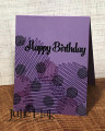
VEry soft look, using the direct to rubber!
------------------------------ Anne HarmonFS154, QFTD58, PROUD FAN CLUB MEMBER (photo of our Great Granddaughter Elise, just 6 months old) and me, even older.
Splitcoast Dirty Dozen Creative Crew SU Design Team Alumni
Registered: May 18, 2004 Location: Southwest Michigan Posts: 37139
Mon, Mar 05, 2018 @ 8:24 AM
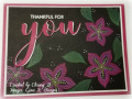
What an appealing design with the flowers and leaves bordering the left side and bottom of your card. That floral image is gorgeous; makes me think of Dahlias. I really like the fresh look of the Mambo and Pear color choice.
------------------------------ Claudia Splitcoast Fan Club Member