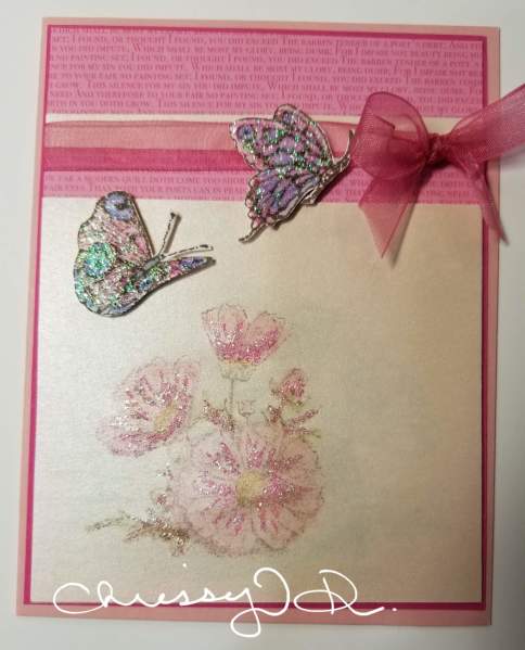
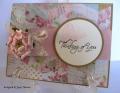
I was trying to go with a softer color - so I think the top is so much brighter and darker - it really makes the flowers along the bottom pale and washed out - unsure if I care for the bottom half of the card! I will have to look at it for a bit.
Thank you for taking a look and commenting.
Date: Wednesday, January 31, 2018 GMT Views: 518
Favorited:2
Splitcoast Dirty Dozen Creative Crew SU Design Team Alumni
Registered: May 18, 2004 Location: Southwest Michigan Posts: 37113
Wed, Jan 31, 2018 @ 4:03 PM
I think the floral image on the lower half of the card is gorgeous and the colors blend perfectly with the sentiment layers and the pink in the butterflies. I really like all the pretty sparkle and the sheer ribbon on this lovely creation.
------------------------------ Claudia Splitcoast Fan Club Member
Registered: October 12, 2007 Location: Arizona Posts: 70675
Wed, Jan 31, 2018 @ 6:11 PM
Beautiful! I like the topper with the different pinks and the gorgeous ribbon & bow. The floral image with the lovely colors and sparkles is beautiful. The butterflies are amazing. Terrific card. I hope it grows on you because it's a keeper. TFS