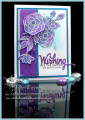
A big congrats to Karen, the newest Featured Stamper! She has a lovely gallery & I was very taken w/ THIS card...the colors, the layout..I just love it. Which is a little strange, because every time I try to use this blackberry or razzleberry color, I get into trouble. For me, they are very hard colors to work with. Anyway, I kept the colors & layout, but used different images & dies & made mine a birthday card.
After I white embossed the flowers & leaves onto white c/s, I sponged on the Distress inks in the purples & blues then die cut the flowers w/ the matching dies. I didn't have paper anywhere near this purply color so I also sponged the wider strip down the side, then stamped the leaves w/ Versamark. I had to sponge the Wishing word to match, too. The white linen bg was sponged w/ the tumbled glass & the rest of the greeting was stamped w/ the Versafine purple ink. I came across a large bottle of dew drops (remember those?) so I added a few.
Congrats again, Karen! Thanks so much for looking. Closeups & the inside are on my blog:The Write Stuff
Date: Saturday, January 20, 2018 GMT Views: 1711
Favorited:10
Registered: July 9, 2008 Location: Stars Fell on Alabama Posts: 74600
Sat, Jan 20, 2018 @ 1:51 PM
Goodness, what a stunning card, Julie. I love your flowers and the most beautiful combo of colors.
------------------------------ My Blog---My Gallery---My PinterestI'm a Punchkateer! (Prez) FOREVERDirty Dozen Alumni2014 CAS Spring DT--- Inspiration Challenge Co- Hostess 12/02/17-12/28/19 Watercolor Wednesday Design Team Hebrews 13:2Brenda
Registered: December 4, 2010 Location: Minnesota Posts: 16610
Sat, Jan 20, 2018 @ 8:05 PM
How gorgeous Julie! I love all the colors peeking through these white embossed blooms. I am so impressed by these dew drops because I have never been able to make them look this great! The purple sentiment die and sentiment really ties the entire design together so beautifully. You have made these colors sing with this gorgeous card! ~Karen.
Registered: October 21, 2010 Location: in the okanagan in b.c. canada Posts: 13012
Sun, Jan 21, 2018 @ 2:21 AM
MY I can see why you chose the one you did and wow what a beauty from that one...just LOVE the colors, and the design so nice especially with the soft sponging under it...lovely idea...TFS...:0)
------------------------------ We as people are raindrops of colorful ink , falling down Crisp and Clear, each a different shade more vibrant then the last, but once we realize at the bottom of an endless abyss we all fall into the same inkpot forming one color, only then can we come together as one My son.
Splitcoast Dirty Dozen Splitcoast Challenge Hostess Teapot Tuesday TEAm
Registered: January 19, 2014 Location: Central Indiana Posts: 89871
Sun, Jan 21, 2018 @ 5:03 AM
Beautiful colors and fantastic emboss resist. You should totally add this to the WTUI challenge we did resist techniques this week. Stunning card from the FS inspiration.