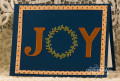
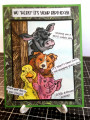
So, I really loved the colors in this collection of ornaments at the Balsam hill store site yesterday and its a funny thing because, I usually do not pick blue as a color I think what caught my attention with them is the copper mixed with the blue so, I decided to try this will these new-ish dies... the frame was cut with two rectangles and this was shot wet so, although it looked straight while I was gluing I will probably trim off some off the left side when its dry. Thanks for this challenge Steph, & tfl.
Date: Sunday, November 12, 2017 GMT Views: 303
Favorited:2
Registered: April 16, 2008 Location: Meridian, Idaho Posts: 8507
Mon, Nov 13, 2017 @ 2:23 PM
The die cut sentiment is wonderful with the wreath standing in for the "o" and the copper really pops against the blue. Lovely color combo and pretty card!
------------------------------ Stef
Splitcoast Color Challenge Design Team Splitcoast Dirty Dozen Alumni