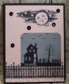
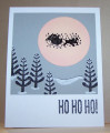
I think this is what they call "high concept." Patty's Falliday challenge was to create a card inspired by the poster for Nightmare before Christmas, using the colors of gray, black, white, and pink/peach. Oh my gosh -- In my mind, I knew what I wanted to do, but I'm not sure I accomplished it, and this was my second try. The Santa and sleigh flying across the moon is just a junky little stamp I got in a cheap craft store set many years ago-- I'm not sure I ever used it before, because it's just not really a good image. But, Santa is black embossed, and there's a little pink sponged around the edges of the moon. the white gel pen is supposed to indicate snow highlights. I'm hoping the Ho ho ho sentiiment will clarify that this is a Christmas card because it is SOOOO non-traditional.
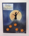
I'm putting it in the Sept gallery for CCC because that theme was trees/outdoors.
Date: Monday, October 30, 2017 GMT Views: 438
Favorited:2
Splitcoast Dirty Dozen Splitcoast Challenge Hostess Proud Fan Club Member
Registered: September 24, 2007 Location: WA Posts: 13911
Mon, Oct 30, 2017 @ 1:52 PM
What a great interpretation of the poster! I love the card, and actually like the Santa stamp! Since blue is my favorite color, you know I like your trees and background!
------------------------------ Barbara Splitcoast Dirty Dozen My website: Inky Fun SCS Fan Club Member Color Challenge Team Member QFTD215
Your title caught my eye! I knew even before pulling up the card for a closer look that it was for Patty's challenge! The colors are fabulous! I love everything about it!
Registered: January 20, 2010 Location: Brampton, Ontario Posts: 26121
Mon, Nov 20, 2017 @ 6:57 PM
I think you really nailed the poster-look with this card! What a great take on the challenge. I remember this one and intended to try it but didn't. I REALLY like this!