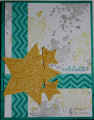
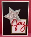
Carla's Ways to Use it Challenge was to rescue a card that we had hiding away that we weren't happy with. I did this with a twist. I confess that the card I wasn't happy with (there has been more than one!), I went ahead and gave to someone for their birthday. I choose people that I know don't really care about the card at all and I'm OK with giving them cards that I may not like very much. Is that bad?! Anyway, when I saw Carla's challenge, I thought of this card that I made but didn't like that much: Starry Birthday by cdimick at Splitcoaststampers and I re-made it. My DD likes the rescue version better and so do I, hope you do too!
I basically made the same card again but changed up the placement of the colors. I used my Bermuda Bay ink pad direct to the edges of the card base to give the appearance of it being a Bermuda Bay card base but it is actually white.
I popped the front panel on fun foam and heat embossed the stars (fussy cut them this time) and sentiment.
Thanks for looking.
Date: Friday, August 25, 2017 GMT Views: 1039
Favorited:5
Registered: March 29, 2011 Location: Covington, WA Posts: 32470
Fri, Aug 25, 2017 @ 8:59 PM
I like both cards, Catherine. I like the white splattered bg of your rescue. Embossing the pattern and sentiment adds a nice sparkle. Thanks for playing in my challenge.
------------------------------ Carla ~ Proud Fan Club Member and Dirty Dozen Alumni.
Splitcoast Dirty Dozen Alumni SCS Gallery Moderator Splitcoast Challenge Hostess Teapot Tuesday TEAm
Registered: July 27, 2007 Location: Dublin, Ireland Posts: 131401
Fri, Aug 25, 2017 @ 11:52 PM
Grins, no, I don't think you're bad at all! I don't think I've ever sent a card that I really didn't like, but I freely admit that I used to send my less preferred cards to people who wouldn't know the difference. And there is also the fact that so often cards we ourselves feel "meh" about, others really like. I think this version of yours packs more punch, mostly with the heat embossing and I think having all the stars the same colours makes a big difference.
Registered: June 27, 2012 Location: Washington Posts: 25246
Sat, Aug 26, 2017 @ 12:44 AM
I like both version, Catherine, but have to say REALLY like this version with its splattered bg and embossed and sparkly stars...this is perfect to make them POP!
------------------------------ Carlene aka Chatterbox-1--My BLOG; My Pinterest;My SCS Gallery; FAVORITES Team Member; 2022 Christmas Card Challenge 75/105. My SCS Goal: Challenge Catch-up; Sketch Challenge Sample Card Team (August 2022--January 2023).
Registered: February 5, 2007 Location: St. Louis, MO Posts: 92384
Sat, Aug 26, 2017 @ 3:30 AM
I like this version with the lighter bg color...understand the other was for a CC and you wanted the gray bg to be "there", but with your light gray spatters, it still is. This is a lovely card, Catherine.
Registered: October 12, 2007 Location: Arizona Posts: 70092
Sat, Aug 26, 2017 @ 7:58 AM
Your first card is fine. I do like this one better. The white background is brighter and shows the splatters off. Love the stars with the shine and the chevron patterned strips. Terrific card design. Regarding sending cards - No, you're not bad. Tee, hee. I do the same at times. Nice changes to your card. Well done. TFS
Registered: August 27, 2014 Location: Santa Rosa, Texas Posts: 12025
Sat, Aug 26, 2017 @ 8:18 AM
Love them both, but I think this one catches my eye quickly. With the heat embossing, the stars and the horizontal and vertical piece really stand out from the background.
Registered: June 18, 2016 Location: South central Pennsylvania Posts: 2197
Sat, Aug 26, 2017 @ 8:20 PM
Catherine, I like both cards. I used to throw a bunch of mine away until I started saying "someone somewhere will like it". Also if you put it out of sight for a while the card fairy comes and fixes it when you aren't watching! She's sweet like that!
Jeremiah 29:11 Splitcoast Dirty Dozen Alumni | Proud FanClub member since 2017
My Gallery | My Blog "The wind of Heaven is that which blows between a horse's ears."