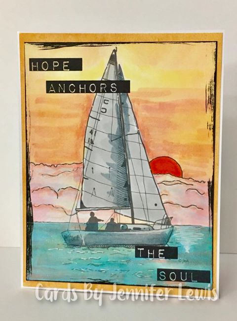
For Cathy's "Sea Worthy" challenge today, I decided to use the Monthly Themes inspiration photo. I thought it was so pretty, so I tried to recreate the color of it using my Spectrum Noir markers on this FTHS digi. My water ended up rainbow and crazy looking, so I sponged over the whole card with Distress inks and ended up with bluer water than I wanted. It's growing on me though. I finished by dragging my Black Soot ink pad around the edges. This is going to the wife of my son's Karate Sensei. She has lymphoma. Fortunately, they say it's a very treatable type.
Splitcoast Dirty Dozen Creative Crew SU Design Team Alumni
Registered: May 18, 2004 Location: Southwest Michigan Posts: 37151
Thu, Jun 22, 2017 @ 3:59 AM
This caught my eye immediately, it's so beautiful. I like the look of the water and the sparkle where the setting sun is hitting it. Your sky is amazing and that sailboat image is extra special because you can see the people in it. What a wonderful card to depict hope for your friend.
------------------------------ Claudia Splitcoast Fan Club Member
Registered: June 29, 2004 Location: Sugar Land. Texas Posts: 79895
Thu, Jun 22, 2017 @ 4:29 AM
Sunrises and sunsets are the prettiest at the ocean. Your card is beautiful, and makes me wish I were on that boat enjoying this God moment.
------------------------------ LizThe joy of the LORD is my strength.Right Brain Madness --My blogProud member of the redDivasKSS certified multi-step stamperFan Club member since 2004
Registered: July 12, 2005 Location: Hugging a golden and stamping' in PA Posts: 21216
Thu, Jun 22, 2017 @ 4:56 AM
Just gorgeous, Jen! Your coloring on this peaceful sea worthy image is beautiful and I love the direct to paper black edge! Thanks so much for adding a bit of the ocean to the gallery today!