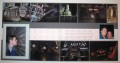
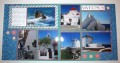
Oh, my goodness! Great choice of the blue paper, because it just makes those photos pop! And that little bit of red just makes it so eye pleasing! Lovely!
Registered: December 17, 2006 Location: in my craft room Posts: 5587
Mon, May 08, 2017 @ 2:01 PM
Don't you just love the picture perfect pictures?? The scenery and air are so clear and blue you can't help but take wonderful shots at every turn. I like how you worked the blue of the photos into your layout!
Splitcoast Dirty Dozen Splitcoast Challenge Host Proud Fan Club Member
Registered: April 11, 2016 Location: Posts: 30055
Tue, May 09, 2017 @ 1:00 AM
Ah Greece....great LO and love the red and agree it makes the photos pop. TFS Happy day
------------------------------ The Difference Between Try and Triumph Is Just A Little Ump Wednesday: Alpha Challenge
Thursday: Ways To Use It Challenge
Monthly: MMJ Challenge….get inky and have fun
Registered: April 5, 2008 Location: Florida's Space Coast Posts: 24517
Wed, May 10, 2017 @ 8:32 PM
Love all the photos matted in red, striking for these stark white and brilliant blue water. Nice idea to have the diagonal striped piece with the journaling block .
------------------------------ Joyce Ann - Layouts completed: 2022/ 218; 2023/ 71. Layouts for 2024: Jan 3=72, Feb 3=75