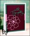
This is such a pretty color combination. Dessert is to make it a sympathy card - did that. It is also my last week as a guest designer for the Color Challenge. Thanks to all the team members and participants for a fun month.
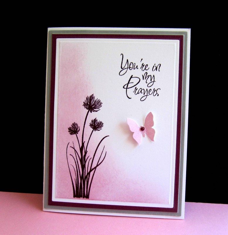
I die cut a white focal panel and sponged with Sweet Sugarplum. Stamped the grass, then the `flowers' over the grass - both with Razzleberry. Stamped the sentiment. Sponged Sugarplum on a scrap of white, punched the butterfly and added a pearl colored with Razzleberry ink. Cut mats in Razzleberry and Slate and assembled the pieces onto a white base.
Dies: Spellbinders/A2 Card Creator. Butterfly is Martha Stewart punch
Date: Monday, September 26, 2016 GMT Views: 6584
Favorited:17
Registered: June 29, 2004 Location: Sugar Land. Texas Posts: 79439
Mon, Sep 26, 2016 @ 8:54 PM
Putting this in my favorites. What a lovely sympathy card! I have to make many of these for my care team obligations for my church.
------------------------------ LizThe joy of the LORD is my strength.Right Brain Madness --My blogProud member of the redDivasKSS certified multi-step stamperFan Club member since 2004
Registered: April 14, 2009 Location: San Antonio, TX Posts: 2721
Tue, Sep 27, 2016 @ 3:37 AM
The way you sponged the ink and the colors you used are beautiful!!!
------------------------------ From Norway to USA to the world, Hilde
You must be the change you wish to see in the world -Gandhi
Host an exchange student!
Registered: October 30, 2007 Location: Posts: 26718
Tue, Sep 27, 2016 @ 5:39 AM
Soft and elegant, a perfect combo for a sympathy card IMO! It has been great having you on the team Priscilla - I always look forward to seeing your cards in the gallery!


 TFS
TFS