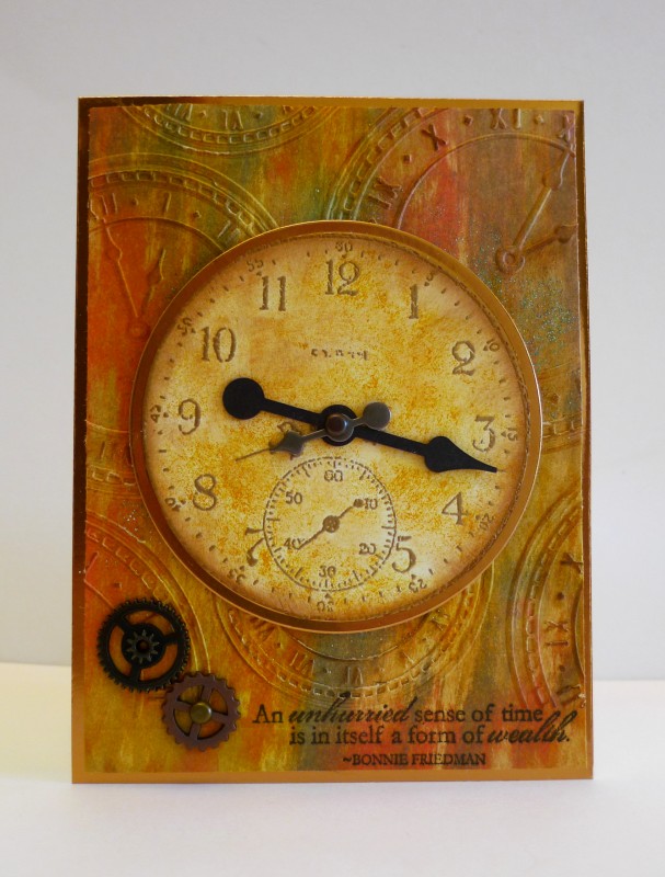
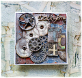
I had a stack of vintage manila paper that I was going to make a mini journal out of and wanted to see how it would react to the distress inks. I love how it drank the ink swipes right up and blended together so well. After swiping various inks and drying, I ran it through the clocks embossing folder and highlighted it with Colorbox Chestnut Roan ink. Stamped sentiment in espresso. Gold embossed clock and inked that Very Vanilla piece and matted to copper card stock.
Splitcoast Dirty Dozen Alumni Favorites Team Notifier Splitcoast Challenge Hostess
Registered: October 26, 2009 Location: Oakhurst, near Yosemite Nat'l Park. Posts: 46821
Fri, Sep 09, 2016 @ 5:17 PM
Ooh, that turned out really gooood! Love the bg with the ink swipes (looks like some really technical technique instead of just swipes!!) and love the inking on the clok! Looks so aged! It is perfect matted in copper, looks like the metal casing of the clock! Beautiful clockworks! Thanks for playing!
------------------------------ Blessings, Robin Encourage one anotherMy Blog-InkMagination , QFTD201,Dirty Dozen Alumni.Impression Obsession DT, ECraftDesigns DT, Formerly HC DT, ODBD DT, DRS DT